
Why Most Dashboard Projects Fail (and How to Fix Them)
If you think a slick dashboard is a win, think again. Dashboards often end up gathering dust because they answer the wrong questions, hide critical data and frustrate the teams who rely on them. Mid-market business leaders demand insights not eye candy. When business intelligence dashboards fail the impact is real: wasted budgets, blind decisions and missed opportunities.
This article explores why business intelligence dashboards fail and shows you how to fix common BI dashboard mistakes. You will learn practical steps to build effective dashboards that drive action, adoption and real business results.
The Hidden Costs of Dashboard Failure
When dashboards fail they do more than look bad. They erode trust in your data function and slow decision making. Consider the real costs:
Wasted investment: Software licences, consulting fees and development hours vanish when dashboards are discarded.
Decision blind spots: Teams revert to spreadsheets and gut feel when dashboards miss critical metrics.
User frustration: Complex visuals and slow load times turn analysts into IT ticket creators.
Lost agility: Slow dashboard updates mean leaders miss market shifts and fail to pivot.
Data distrust: When numbers never align across reports, nobody trusts a single source of truth.
If your dashboard fails, you lose more than data. You lose confidence in business intelligence solutions.
Top Reasons Why Business Intelligence Dashboards Fail
Wrong questions, wrong data
Teams build dashboards without clarifying the key decisions they support. The result is beautiful charts that answer no one’s real questions.
Too much complexity
Overloaded dashboards with dozens of widgets overwhelm users. When nobody knows where to look they stop using the dashboard.
Bad visual choices
Fancy charts may look impressive but hide trends. Pie charts with too many slices, 3D effects or tiny text kill readability.
Lack of data governance
Inconsistent definitions for metrics like "revenue" or "customer" lead to conflicting numbers and manual reconciliation.
Poor performance
Slow loading dashboards frustrate users. If it takes minutes to refresh, teams go back to static reports or manual processes.
No user training
Dashboards become orphaned when users do not know how to navigate filters, drill into details or interpret metrics.
Neglecting mobile
Many leaders review dashboards on the go. If your BI solution lacks a mobile-friendly design you miss a vital use case.
Ignoring feedback loops
Projects often end once development is over. Without regular feedback sessions dashboards drift from evolving business needs.
These common BI dashboard mistakes explain why many initiatives never deliver on their promise.
Practical Advice to Fix Dashboard Failure
1. Start with Decisions, Not Visuals
Interview stakeholders: Document the top three decisions each team makes daily.
Map decisions to metrics: Link each decision to one or two key metrics. This gives you a clear dashboard scope.
Validate questions: Share draft questions with users to confirm they cover real needs.
2. Design for Clarity and Speed
Use simple charts: Line and bar charts often communicate trends more clearly than complex visuals.
Limit widgets: Aim for no more than 5 to 7 visuals per dashboard. Each must earn its place.
Optimize queries: Work with your data team to cache common queries or use materialised views for faster performance.
3. Align on Metrics and Definitions
Create a metric dictionary: Define every KPI with calculation logic, source system and owner.
Hold data governance meetings: Review key metrics weekly to build consensus and catch drift.
4. Build Iteratively and Get Feedback
Deliver in sprints: Release incremental dashboard versions every two weeks.
Run user testing: Schedule sessions where real users perform tasks on the dashboard and give feedback.
Iterate visuals: Adjust charts, filters and layout based on feedback. Small changes prevent big rework.
5. Invest in Training and Support
Create quickstart guides: One-pagers on how to use filters, export data and set up alerts.
Host drop-in clinics: Weekly sessions where users can bring questions and get live support.
Champion power users: Identify enthusiasts in each team to advocate dashboard usage and gather feedback.
6. Monitor Usage and Value
Track adoption metrics: Measure dashboard logins, active users and most viewed pages.
Survey user satisfaction: Quarterly polls to rate usefulness and identify pain points.
Capture impact stories: Document cases where dashboards drove a key decision or saved time.
Step-by-Step Guide: How to Build an Effective Dashboard
Define purpose: State the primary goal of the dashboard in one sentence.
Gather requirements: Work with end users to list key metrics and desired visuals.
Design wireframes: Sketch the layout on paper or use a prototyping tool like Figma.
Prepare data: Build clean, consolidated views in your data warehouse for each metric.
Develop dashboard: Use your BI tool (Tableau, Power BI or ThoughtSpot) to implement wireframes.
Test performance: Measure load times and optimise queries as needed.
Review with users: Demo the dashboard, collect feedback and note change requests.
Iterate and refine: Update visuals, add filters or adjust calculations in short cycles.
Launch and train: Roll out with user guides and hands-on training.
Maintain and evolve: Regularly review metrics, chart relevance and user feedback.
Tools and Best Practices for Dashboard Success
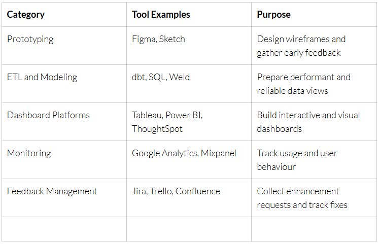
Use these tools and practices to support each phase of your dashboard project life cycle.
Conclusion: Stop Building Dashboards Nobody Uses
Dashboards fail when they focus on style over substance. If your BI team treats dashboard creation like art, expect it to gather dust. Business intelligence dashboards must serve decisions, not just impress executives.
Flip the script. Start by asking: why would a busy manager open this dashboard today? Design for that answer. Clean your data. Simplify visuals. Train your users. And measure your impact.
When you build dashboards that people actually use to make decisions you justify every dollar spent and earn your place as a data champion in the organisation.
Ready to fix your BI dashboard failure? Pentify Insights works with mid-market companies across Australia to design, build and optimise dashboards that deliver value from day one. Reach out at www.pentifyinsights.com to start turning data into action.